For any garment-care suggestion, follow the individual care label first. Read our care guide.
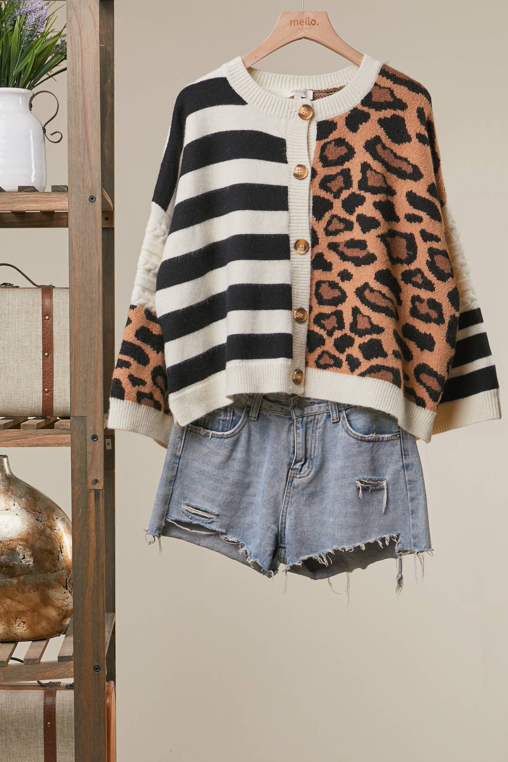
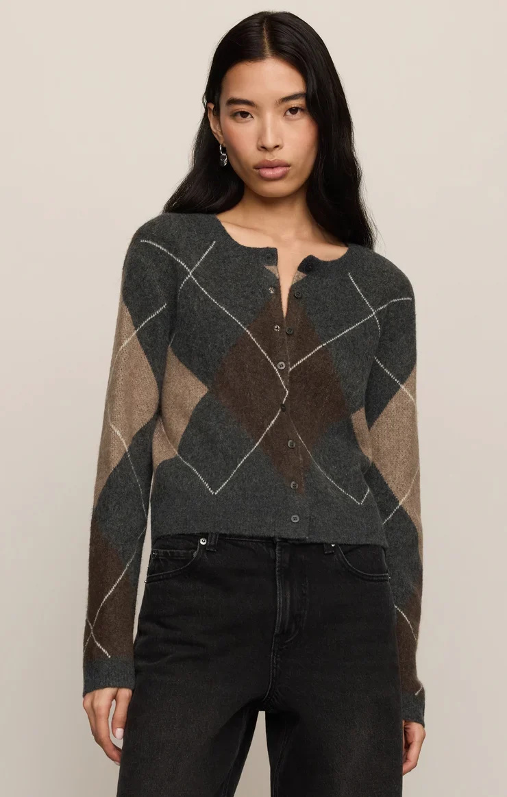
Mixing patterns is less about following a strict formula and more about giving each print a place to belong. Color is a welcoming starting point: a handful of related shades can connect florals, stripes, checks, and animal-inspired motifs without making an outfit feel overly matched. At A Likely Story Boutique, we love the confidence that comes from trying a combination that feels both considered and playful. Begin with colors you already enjoy wearing, then build a palette that lets your patterns talk to one another.
Choose an Anchor Shade
Pick one color to act as the outfit’s anchor. It might be a shade repeated in both prints, or a neutral that appears in one pattern and in a solid piece. This visual connection helps separate patterns feel related, even when their motifs are quite different.
A simple way to begin is to lay the pieces side by side and notice which color your eye returns to first. Carry that shade into another part of the outfit, perhaps through a top, bottom, or layering piece. Repetition creates rhythm without requiring exact matches.
Build a Small, Flexible Palette
Limit the starting palette to two or three colors, with a neutral if it helps. A narrow range gives each print room to show its character while keeping the overall impression calm. The colors do not need to be identical; similar warmth or depth can be enough.
For instance, combine a print with warm accents and another pattern that includes a related earthy shade. If the pairing feels too busy in the mirror, remove one color rather than abandoning the idea. A smaller palette often makes experimentation feel easier and more natural.
Let Pattern Scale Take Turns
Color connects the prints, while scale gives them breathing room. Pair a larger, more noticeable motif with a smaller or more closely spaced pattern. This contrast helps the eye move around the outfit instead of treating every detail as equally loud.
If both patterns are bold, look for a shared shade that appears clearly in each and keep the rest of the outfit quieter. A solid layer can create a pause between prints, making the combination feel intentional rather than crowded. Think of it as a little visual space.
Use Neutrals as a Pause
A neutral does not have to be the main event to be useful. It can sit between two patterns, grounding the colors and giving the outfit a place to rest. Choose a neutral that feels at home with the palette, rather than adding one automatically.
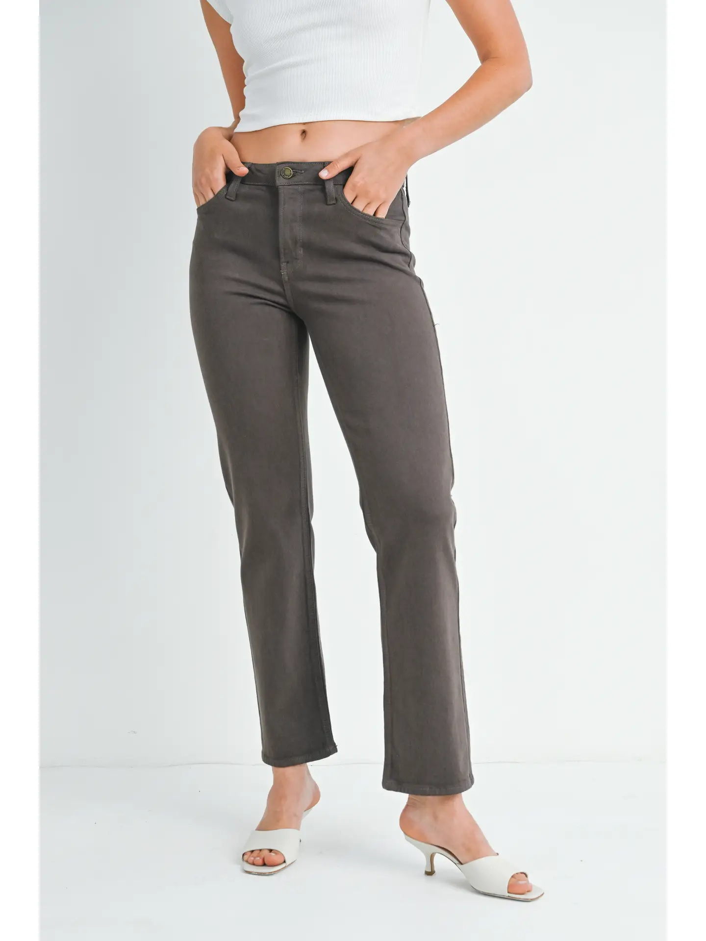
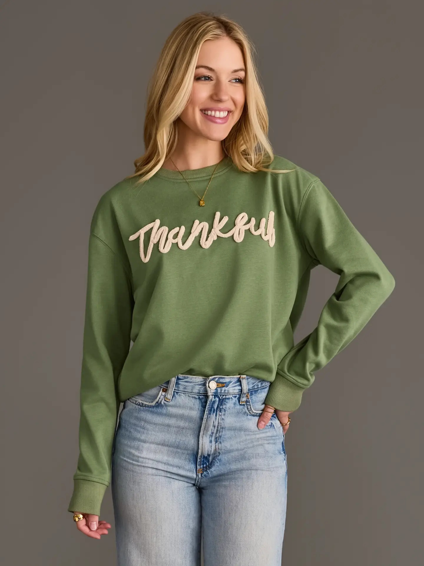
Black, white, denim, and earthy tones can each play that supporting role, depending on the prints and the mood you want. Try one neutral piece at a time and check whether it clarifies the pairing. If it competes, choose a softer or less prominent option.
Finish with a Whole-Look Check
Before heading out, step back and look at the full outfit rather than judging each print separately. Notice where the strongest colors land and whether one area feels much busier than the rest. A small adjustment—a different layer or a simpler piece—can restore balance.
Comfort with a combination often grows through trying it on and making one change at a time. Take a quick mirror photo if that helps you see the palette with fresh eyes. The goal is not perfect coordination; it is a look that feels lively, wearable, and like you.
Use Color Temperature to Connect Prints
When two patterns share no obvious shade, compare their overall temperature. A rust-and-cream floral may sit comfortably beside a stripe with warm ivory, while cool blue and crisp white can link separate motifs. Lay the pieces together in daylight if possible; indoor bulbs can shift how colors read and make a promising pairing seem unexpectedly harsh.
Temperature is a useful guide, not a ban on contrast. To mix warm and cool prints, repeat a bridging shade such as soft taupe or muted green in a third piece, or let one print carry most of the contrast. This helps the combination feel deliberate without requiring the patterns to contain identical colors.
Plan Pattern Placement Across Layers
Think about where each print will appear when the outfit is worn, not only how the pieces look laid flat. A patterned collar peeking from beneath a printed jacket creates a small meeting point, while a visible cuff can repeat a color near the hands. Adjust hems and sleeves so the prints show in controlled, intentional areas.
Layering also lets you change the amount of pattern during the day. Start with a printed shirt under a cardigan or jacket, then remove the outer layer when you want the inner motif to become more prominent. Before leaving, check that the overlap does not hide the feature you most want to show, such as a border or distinctive central motif.
Choose Prints for the Occasion
Let the setting guide how much visual contrast you introduce. For a relaxed daytime plan, combine familiar motifs in colors that feel easy to wear, such as a fine check with a modest floral. For a more polished setting, choose prints with cleaner edges or a restrained color contrast, and make sure the combination still feels comfortable for the activity.
Consider the background as well as the motif: dense, high-contrast prints can read more assertively than open designs, even when their colors are similar. If you are unsure, wear the pairing at home for a short while and notice whether it suits the pace of your plans. Keep a simpler layer available so you can adjust the impression without rebuilding the outfit.
Repeat Patterned Pieces with New Partners
Make a mixed-print outfit more useful by treating each patterned garment as a separate wardrobe piece on other days. Wear one print with a plain item you already reach for, then test it beside a different pattern from your closet. This gives you several combinations to assess before deciding whether the original pairing deserves a regular place in your rotation.
A quick outfit note can make those trials practical: record the pieces, the colors that worked together, and any layering adjustment that helped. Keep the note specific, such as “wear the smaller check under the open shirt,” rather than declaring a strict rule for all prints. Over time, you will have reliable options while leaving room for fresh combinations.
Let color be your guide, not a rulebook. Start with a shared shade, vary the scale, and use a neutral when the outfit needs a pause. With a little experimenting, patterns that once seemed difficult to pair can become an inviting way to show your personal style.